
Common Color consultation Mistakes People Make with Color consultation in Redding
Choosing paint colors for your home should be exciting, but it often becomes one of the most stressful decisions homeowners face in Redding. You stand in the paint aisle staring at hundreds of color chips, or you scroll through Pinterest for hours, only to paint a wall and realize the color looks nothing like you imagined. The problem isn't that you lack taste or judgment. The problem is usually that you're making one or more of the same mistakes that plague most DIY color selection projects. At American Home Painting, we've watched homeowners in Redding struggle with color decisions for years. Many of these frustrations are entirely preventable. This guide covers the most common mistakes we see and how to avoid them so your next painting project turns out exactly as you envision it.
Mistake 1: Ignoring Lighting Conditions in Your Redding Home
The single biggest reason people hate their chosen colors after painting is poor lighting assessment. A soft, warm beige that looked perfect under the bright fluorescent lights at the paint store can look dingy and yellow under your home's natural light. Conversely, a color that seemed too bold at the store might look washed out in a naturally dark room.
Redding's intense sunlight and high-desert location create specific lighting challenges. South-facing rooms get harsh, direct afternoon sun that can make cool colors appear slightly greenish and warm colors appear overly saturated. North-facing rooms, which are common in many Redding neighborhoods, tend toward cooler, dimmer light that can make warm colors feel dull.
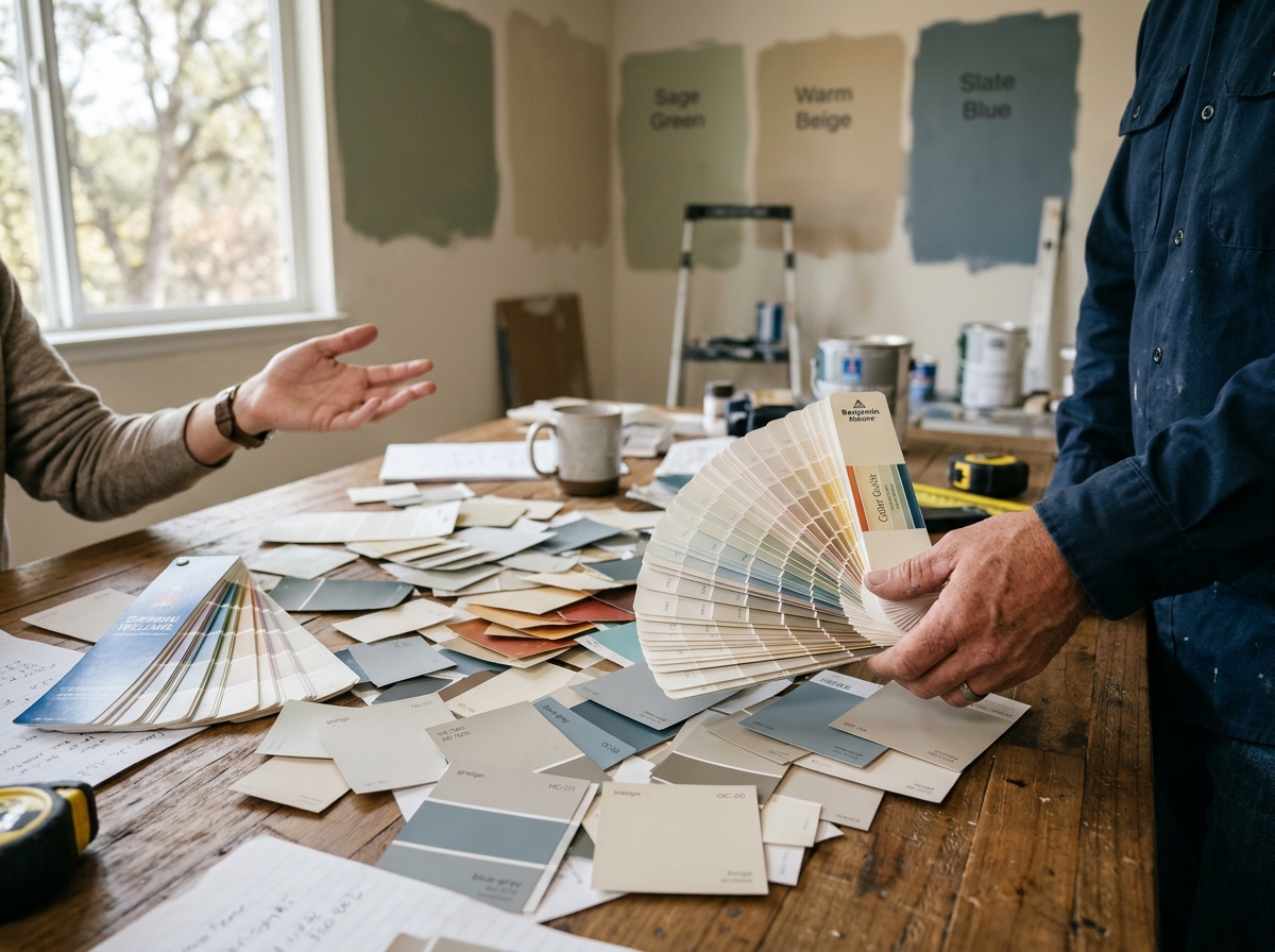
Before committing to any color, test paint samples on your actual walls at different times of day. Paint large swatches, not just small chips. Look at them in morning light, afternoon light, and evening light. This simple step eliminates most color regret before it happens. Many professional color consultation services include this testing phase as standard practice.
Mistake 2: Not Considering Undertones and How They Interact
Paint colors aren't just "blue" or "gray" or "beige." Every color has undertones, those subtle secondary hues that make a massive difference in how the color actually appears on your walls.
A gray might have blue undertones, green undertones, or warm brown undertones. A beige might lean toward pink, yellow, or even purple. If your room has warm wood tones and you choose a gray with blue undertones, the color will clash and create visual tension that feels "off" without you quite knowing why.
This is where many Redding homeowners go wrong with DIY color selection. You see a color you like in a magazine or online, but you don't think about what undertones exist in your existing furnishings, flooring, and trim. A professional Color consultation takes these interactions into account, ensuring your chosen color complements rather than conflicts with everything else in your space.
Mistake 3: Choosing Colors Based Solely on Trends or What Works in Someone Else's Home
Social media has made it easier than ever to find color inspiration, but it's also made it easier to make mistakes. That trendy sage green that looks stunning in a minimalist farmhouse blog might clash with your Mediterranean-style home in Redding. That deep navy blue featured in a designer's portfolio might overwhelm your small bedroom.
Trending colors also have a shelf life. The gray that dominates homes right now might feel dated in five years. When you're investing in painting your home, you want colors that work with your specific architecture, climate, and personal style, not colors that are temporarily popular.
Professional painters in Redding understand how colors perform in different contexts. They can help you find colors that suit your home's character and your personal preferences, rather than just what's currently fashionable.
Mistake 4: Failing to Account for Sheen and Surface Quality
Color isn't the only variable that affects how paint looks on your walls. The sheen level, or finish, dramatically changes the appearance of any color. A matte finish absorbs light and makes colors appear deeper and more sophisticated. A glossy finish reflects light and makes colors appear brighter and more vibrant.
Many Redding homeowners choose a color, then pick whatever sheen the paint store recommends without thinking about how it affects the color's appearance. A soft cream in matte finish looks completely different from the same cream in satin finish. The satin version will appear slightly brighter and more luminous.
Additionally, the quality and type of paint affects color performance. Budget paints often have less pigment, so colors appear duller or less true to the chip. Premium paints provide richer, more accurate color representation. This is particularly important in Redding, where the intense sun can fade lower-quality paints more quickly.
Mistake 5: Skipping Professional Guidance for High-Stakes Spaces
Some spaces in your home matter more than others. Painting your bedroom the wrong color is frustrating. Painting your kitchen or main living area the wrong color is expensive and disruptive to fix.
Many homeowners attempt DIY color selection for these high-stakes spaces and end up disappointed. They might choose a color that's too bold for the space's size, too dark for the amount of natural light, or too trendy for a long-term investment.
A professional color consultation is especially valuable for kitchens, bathrooms, and main living areas. The investment in professional guidance typically costs far less than the cost of repainting if the color doesn't work out. Professionals in Redding can provide color recommendations based on your specific space, your lifestyle, and your long-term vision for the home.
Mistake 6: Not Testing Colors in Adjacent Spaces
Paint colors don't exist in isolation. The color you choose for your living room affects how colors in your adjacent hallway and dining room appear. If you're planning to paint multiple connected spaces, you need to consider how colors transition from room to room.
Many Redding homeowners choose colors for each room individually without thinking about the overall flow. You end up with colors that clash when viewed together, or colors that create visual chaos rather than a cohesive home interior.
Professional painters understand color flow and transitions. They can help you select a palette of colors that work together throughout your home, creating a sense of intentional design rather than random room-by-room choices.
Mistake 7: Ignoring the Condition of Existing Surfaces
Finally, many people choose colors without considering the condition of the surfaces they're painting. Existing stains, water damage, or uneven surfaces affect how color appears. A wall with visible water stains or texture issues will look worse in a light color than a darker color.
If you're planning to paint over existing paint that's in poor condition, or if you have walls with significant imperfections, these factors should influence your color choices. A professional painter can assess your surfaces and recommend colors that will look great once properly prepared and applied.
Choosing the right paint color doesn't have to be stressful or result in regret. Most Color consultation mistakes stem from skipping important steps, not accounting for your specific space, or making choices without professional input. If you're planning a painting project in Redding and want to ensure your color choices are perfect, consider working with American Home Painting for color consultation services. Our team has helped hundreds of Redding homeowners select colors they love, accounting for lighting, undertones, architectural style, and long-term satisfaction. Whether you're painting a single room or your entire home, professional guidance makes the difference between a color you tolerate and a color you absolutely love.